The First Impression with Cannabis Packaging Design Trends
January 15, 2021
Cannabis. The word alone brings an assortment of images to mind – edibles, creams, beverages, oils, flowers, and more. The diverse product selection in the cannabis industry means an even wider array of cannabis packaging design options for brand owners to choose from! A few of the most common packaging formats are plastic and glass jars for flowers and edibles, flexible packaging and tubes for creams, and bottles and cans for cannabis infused beverages. As more and more brands enter the cannabis market, it’s important to keep up with the trends to differentiate your product and stay in compliance with ever-changing guidelines.
Branding
During Pack Expo Connects last year, we sponsored a Cannabis TrendChat! Experts in the cannabis industry discussed and gave insight on packaging, the industry, production, and more. One of the main take-aways from the discussion was the importance of branding. Think of branding like a first impression. As the saying goes, you only have 5 seconds to make your first impression with someone and we are all too familiar with the ‘forgotten first impression’. You know, the moment of “I know I met them, but what’s their name again…?” On store shelves brimming with cannabis products, what makes yours stand out? You don’t want to be that product that gets picked up but put back on the shelf only to be forgotten because your competitor had a more remarkable 5 seconds.
A strong and consistent brand image is like the smile and firm handshake of a good impression. It’s welcoming and memorable! As the number of cannabis brands steadily climbs, so will the number of first impressions consumers have in the store. Overtime as a consumer becomes familiar with their options, they’ll opt to purchase a recognizable brand that they trust.
But we know branding is more than a label, just like people are more than a first impression. A brand is also a company’s mission and values. As we saw throughout 2020, it’s not uncommon for consumers to purchase products because they align with a company’s values. Here at Inland, our mission is being a collaborative partner with our customers, suppliers and communities. But for your brand it might mean something different. Let your branding help communicate the values and quality of your product and company!
Not only does a consistent and strong brand image shine a light on your product on crowded dispensary shelves, but it can help prevent counterfeiting. While cannabis products have slowly become more and more popular, the black market is still alive and well. Having a strong brand will help your customers avoid an imitation version of the real deal!
Color
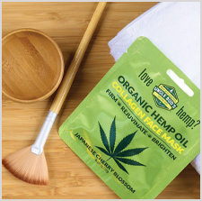
Now that we covered how branding can make a good first impression, how do we make it great? Easy, with the second cannabis packaging design trend, color! While branding is like the smile and firm handshake, color is the personality! A distinct and consistent brand coupled with bright vibrant colors can really make a splash in a sea of cannabis products.
Cannabis packaging design used to feel sterile, medical, and cold. Now brands are experimenting with intricate designs filled with color to minimalist styles with high impact! No matter what style speaks to your brand, quality color can make a big influence. But eye-catching hues aren’t the only thing that can make a first impression great. Adding in design embellishments like foils, metallic inks, tactile coatings, and more can give your product the confidence to nail its introduction. Check out our webinar, Build Your Brand – Craft a Killer Label, where we cover a variety of different label types and their design embellishments!
Redesign
It can be hard to make a first impression, and maybe the initial attempt wasn’t where you wanted it to be. Fear not! While our next topic isn’t a cannabis packaging design trend, it is a frequent occurrence – redesigns. With ever-changing regulations, we know it’s essential to update your products’ labels and packaging to stay in compliance. In the United States it’s difficult to keep up with each state’s requirements, while in Canada, the guidelines are the same across the board. Some of the common requirements in the states are child resistance, use guidelines, concentrations per serving, ingredient lists and a clear indication of warning.
As guidelines for labeling and packaging change, sometimes all you need is a minor artwork change to accommodate new adjustments. Other times you may need to completely rethink your branding, graphics, or colors to adhere to labeling and packaging guidelines. A redesign can be challenging, but with the right partner, they can be seamless (check out our redesign with Blue Moon).
As we get to know cannabis and all its products, it’s changing from stranger to friend! As the market becomes more mainstream and accepted across the states, cannabis brand owners are starting to take an approach similar to big consumer packaged goods brands. Color and branding are just the first step, in a bright future for cannabis!